This is an important topic for the modern day digital marketing professional. Data visualisation is all about the process of displaying your data in various forms. It’s essential for interpreting the dataset, helping to present ideas and findings to an audience in a much clearer and simpler way. In this post, we will discuss some basic principles of data visualisation.
Types of Data Visualisation
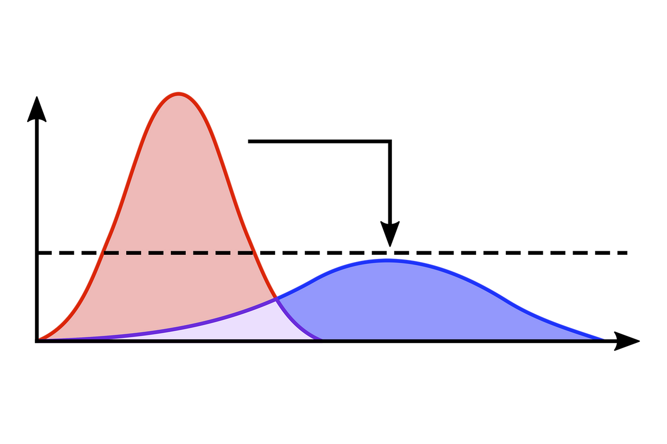
Obviously, there are many different charts and graphs that can be used to demonstrate data. Let’s discuss some super common ones now:
1. Bar Charts
Bar charts are used to compare different categories of data. The height of the bar represents the value of the category. They are commonly used to represent data sets that have separate, discrete categories.
2. Line Charts
Line charts are ideal to show trends over time. When correctly used, they help to represent data sets that have continuous variables. Often, line charts will be used with a bar chart, representing values of categories instead of trends over time.
3. Scatter Plots
Scatter plots are a great option because they can be used to show the relationship between two variables on the X and Y axes. Each point on the scatter plot represents one observation in the data set. A line of best fit can be drawn onto the plot too to show the general relationship of the variables. Sometimes, clustering can be done to show how there might be some natural groups in the data set.
Best Practices for Data Visualisation
Choosing the right visuals can be tricky. When creating your visualisations, it is important to follow best practices to ensure that the message can be delivered clearly without any confusion. Some tips that you can follow help guide you are below:
1. Keep it Simple
The charts should be simple and easy to understand. Avoid using too many colours, fonts, and unnecessary elements. Consider if some options such as grid lines, legends and labels are absolutely necessary.
2. Choose the Right Visualisation
Choose the right visualisation for the type of data you are representing. For example, a bar chart is not appropriate for showing trends over time, but instead a line chart should be used instead.
3. Label Axes and Titles Clearly
Make sure that the axes and titles are labeled clearly. Clarity of axes and titles can make all the difference, and will help the audience understand the message that is being conveyed.
Conclusion
In conclusion, data visualisation is a powerful tool for interpretation of data. It allows us to show data in ways that are easier to understand.
From your marketing perspective, you probably want to think about how you want to show a campaign’s performance. It may be to look at how certain variables might be related to revenue or conversions, or perhaps it’s because you need to compare a metric week on week.
When creating data visualisations, it is important to follow best practices to ensure that the message is clear and that there is no confusion around what the key points are. Remember to keep it simple, choose the right visualisation, and label axes and titles clearly. If you can apply these best practices, you can create effective data visualisations that will help your audience to understand the data better, leading to more informed decisions.